//

MyCourses

College Data Reimagined.

Role
User Interface, Visual Design, Wireframes
Client
College Project
year
February 2015
Project Details
MyCourses is the backbone of 95% of both online and in-person courses at the Rochester Institute of Technology.
It allows students and professors to share important course information, engage in discussions, facilitate quizzes, and more. But the system has its flaws. We were tasked with identifying these pain points and developing a solution to make MyCourses a system students and professors want to use.
Background

Let the Students Speak.

To understand the pain points students face using MyCourses, we sent out a survey to first year, second year, third year and fourth year students. We discovered that students spend between 15 and 120 minutes on MyCourses per visit. Nearly all students found MyCourses difficult to navigate and reported that the discussion board actually inhibits rather than facilitates discussion.
Highlight

Wireframes Lead the Way

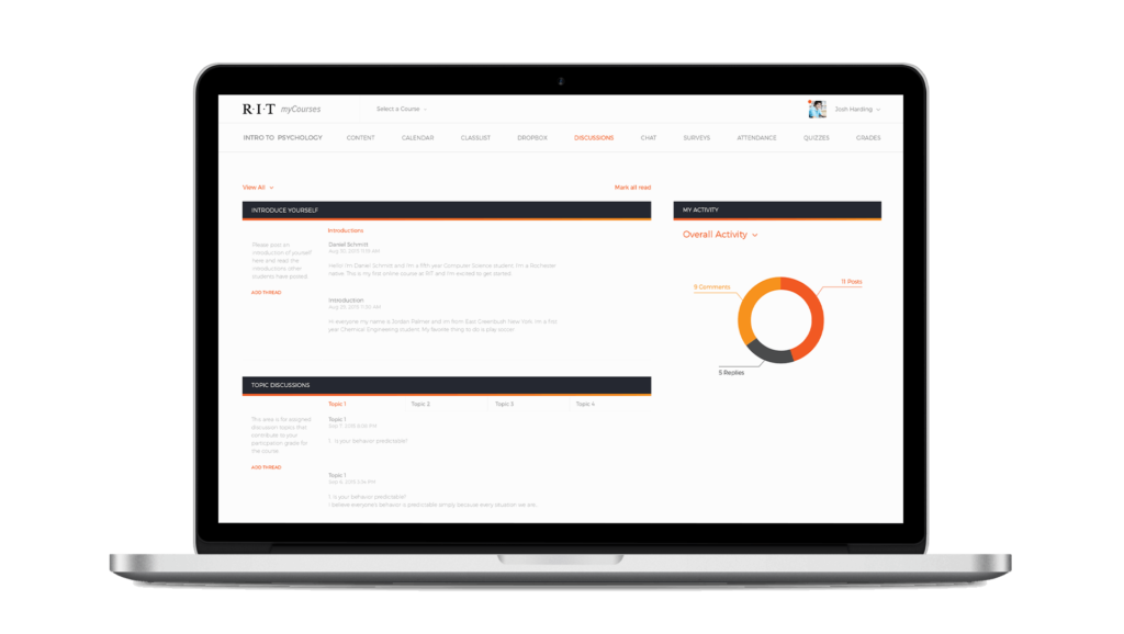
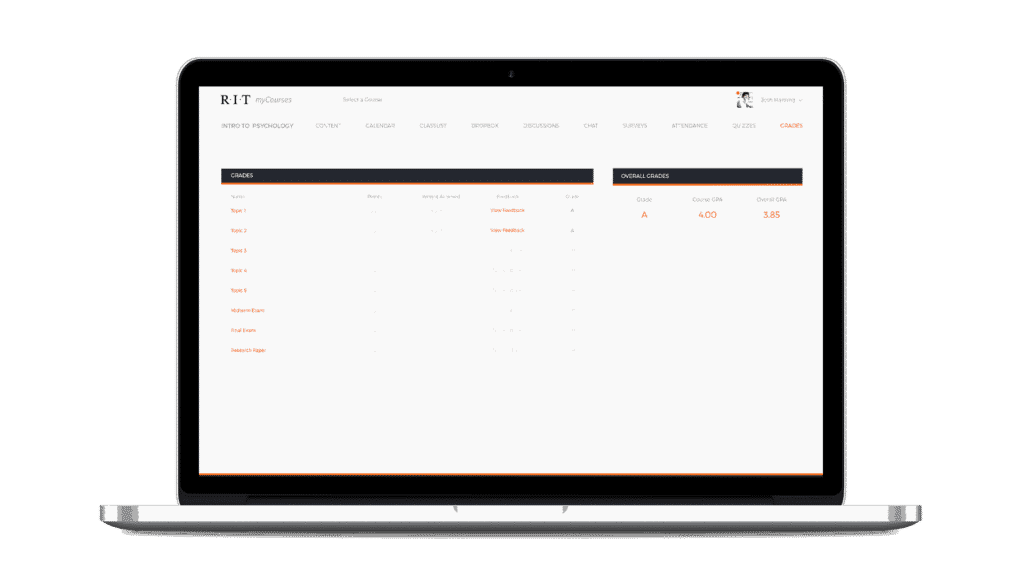
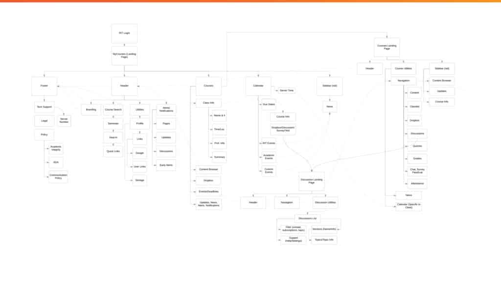
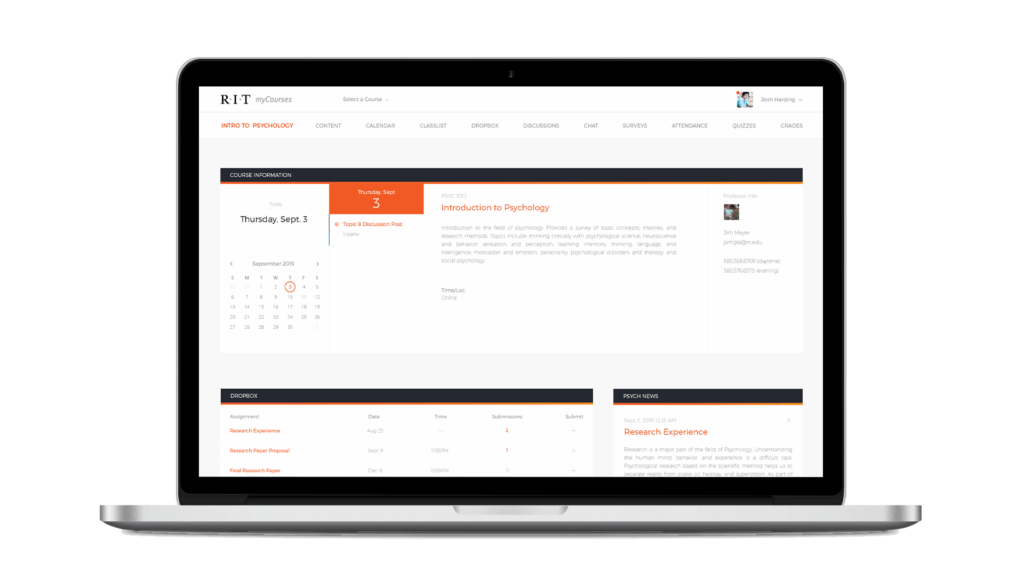
After conducting user research and understanding the pain points students face, we designed wireframes to create a better direction for MyCourses. We iterated through several versions, completely throwing out and restarting at one point, to narrow it down to new and improved concept.
//
Our goal was to create a painless experience for professors and students to interact outside of class.
solution

A Focus on Deliverables and Discussion

When we reached out to students, we found that only 67% of respondents receive feedback on work, 42% had missed deadlines, and the discussion board was the area that caused the greatest frustrations.

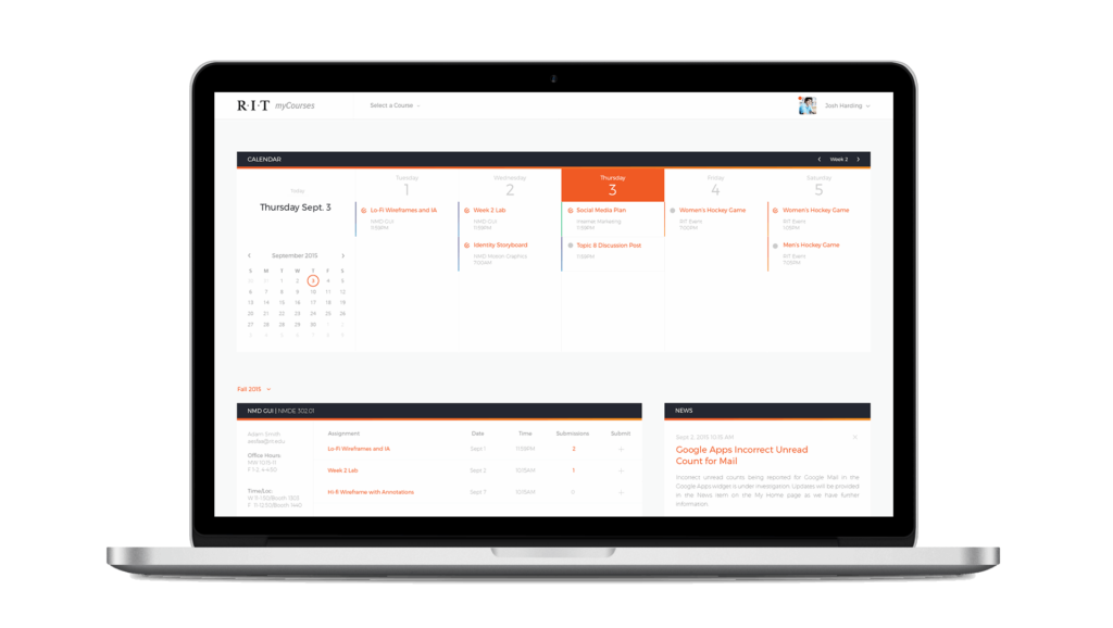
Our revised direction put a focus on deliverables and discussion to help prevent missed and late work, while making it as easy as possible to participate in course discussions and obtain feedback from professors. A unified calendar of events, plus quick stats on discussion activity allow students to know when they have work do at a glance.
takeaways
//

Learning Experience

While MyCourses is one of my older projects, I still love to include it in my portfolio because it provided one of the greatest learning experiences of any of my individual projects. Even today when I look back at this project I learn something new. One of the biggest take-aways from this project: the power of user research and user feedback. These are essential steps to design an experience that meets the users’ needs.

First Ideas Aren't Always the Best

Unfortunately, I no longer have the original designs from our first go at this project. But needless to say, the first versions didn’t work so our professor forced us to ditch everything and start again from scratch. It was a painful lesson, but it taught me the importance of going back to square one to re-evaluate the problem to be solved in order to ensure that I design the best solution.

How Could We Improve?

Coming back to this project several years later, I would love to tackle this project from scratch. I would conduct more user research and user testing to really get to the core of the problems both students and faculty face with MyCourses. As a student during my final year at RIT I took several online courses, and that experience highlighted more pain points and frustrations that need to be addressed with MyCourses. Coming soon: A Re-Look at MyCourses